Problem
You have ingredients. You've cooked a hundred meals. You still can't decide what to make.
Recommendations feel generic because they ignore what you've already proven you'll make. They feel earned when they come from your own memory: your ratings, your favorites, the ingredients in your fridge. That changes everything.
Early research
Five people, three questions, zero apps in sight
I asked five people who cook regularly: How do you decide? Do you repeat meals? Where do you remember them? All five rotated the same core meals, but kept them in their heads, in Notes, or on paper, never in an app. They reasoned from mood, fridge contents, or a protein they had on hand. Recipe apps lost them by skipping the why, forcing rigid portions, or being inconsistent.
Product definition
Three decisions that shaped the design
Before drawing a single screen, I answered three questions. Each answer said no to a whole category of design work I would otherwise have wandered into.
Question 01
What do you see in the first 10 seconds with nothing planned?
Dishes you've made, not recipes you haven't. A short list seeded from what you already love, never a browsing feed.
Question 02
What is the minimum unit of using Plateful?
One meal decision, not a weekly plan. Quick enough to make a few times a week, with nothing to maintain.
Question 03
What happens when someone doesn't follow through?
Nothing. No streaks, no guilt, no judgment for skipping a day, the call that keeps Plateful from becoming a diet app.
The hardest part was surfacing what someone had cooked and liked without it feeling like surveillance. Solved with a one-line reasoning cue under every card ("You made this in June · ★★★★☆" or "Similar to your Salmon Bowl"). One card component, one line that changes.
Meal card
No reasoning line. A card only carried tags and a name.
Meal card
The same card now carries its own reasoning line: a date and rating for a past meal.
Design principle
One sentence I tested every feature decision against
"Plateful helps people who have trouble deciding what to cook pick dishes to make this week by drawing from meals they've already made and liked, without turning it into a diet app."
Scoping
What almost made it in, and why it didn't
Six core features, two nice-to-haves. Two got cut before I drew a single wireframe, not because they were bad ideas, but because they picked a fight with the answers above.
Kept: Meal memory, Factual filters, Personalized picks, Fridge & leftovers.
Cut: Social feed, Recipe discovery feed, Judgment tags. Deferred: Grocery lists.
Iterations
What changed as the team learned
Finding 01
People reasoned from ingredients they already had
Tested wireframes with five people. Prediction: they'd scroll the My Meals list and pick something. Reality: three of five reasoned from what they already had in the kitchen, sorting by fewest ingredients and lowest effort, the pantry-matching idea I'd cut in scoping as "not mine to keep," now validated and rebuilt.
Added ingredient filtering and ingredient-count visibility
Add a Meal
No ingredient field. Protein was a single optional button.
Add a Meal
Still implied only. "Minimal ingredients" existed as an AI tag, not data.
Add a Meal
Key Ingredients became a first-class field, entered as chips.
Meal Library
Cards carried rating and tags. Nothing about what a dish takes.
Meal Library
Every card leads with its ingredients, so the list can be scanned the way testers actually reasoned.
Finding 02
The heart icon meant save, not favorite
Prediction: the heart icon on Add Meal would read as "favorite." Reality: users read it as save/unsave to their library. I replaced it with a labeled "Favorited" toggle, moved below the rating, so it only appears once a meal's actually been logged.
Replaced the icon-only heart with a labeled Favorited toggle
Add a Meal, icon-only heart
- An unlabeled heart carried the whole meaning, and the icon read as save rather than favorite.
- It sat at the top beside the meal name, before any rating had been given.
Add a Meal, labeled toggle
- The bare icon is gone, the control now names the action instead of implying it.
- It moved below the rating, so favoriting follows logging rather than preceding it.
Finding 03
Smaller findings that shaped secondary decisions
"Logistics" became Convenience after two users missed it, compact cards let people compare before committing, the reasoning line earned its place on every card, and AI chat discoverability got flagged for more testing.
Four targeted changes to labels, layout, and reasoning cues
Behind the scenes
Data model and ingredient matching, solved together
Midway through hi-fi design, recipes from the AI chat and logged meals with ratings kept wanting to be different screens. The fix was a data model change, not a screen change: a meal is one object that can be in one of two states.
My own testing kept pointing at one open question: what actually happens when someone types an ingredient. I brought in a developer to answer it: fuzzy matching, a manual synonym list, Spoonacular for recipe data, and Claude filling in the title and tags after a photo upload.
Matching
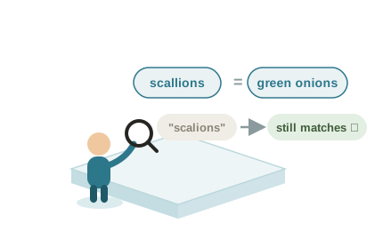
What people actually type
Synonyms and typos still resolve to the same ingredient.
Recipe data
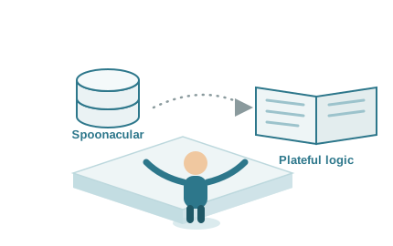
Not reinvented
Spoonacular feeds the matching and reasoning logic.
AI assist
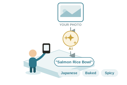
Filling in the boring fields
A photo becomes a title and tags, automatically.
Gallery
From wireframes to final flows
A second, smaller round of testing on the hi-fi prototype confirmed the earlier fixes held. The ingredient filter and the labeled favorite button both tested cleanly, with no repeat confusion.
Onboarding: splash, dietary preferences, allergies, cooking preferences, Home.
Narrowing the Meal Library by ingredient filter.
Asking AI: one-question chat, recipe suggestion card, View recipe.
Logging a meal: Add a Meal, with Key Ingredients and AI-suggested tags.
Impact
Results and signals
90%+ faster
Time to decide what to cook
4 of 5 testers went from a few hours of deciding to a few minutes, and some said seconds. Estimated from self-reported times.
2 rounds of testing
Wireframes and the final prototype
The second round, on the hi-fi build, confirmed the ingredient filter and labeled Favorited toggle both held with no repeat confusion.
4/5 very satisfied
Functionality
4 of 5 testers of the final prototype said they were very satisfied with how the app worked.
4/5 found it helpful
Deciding what to cook
4 of 5 testers said Plateful helped them choose a meal, which was the problem it was designed to solve.
Challenges
Constraints that shaped the design
Showing memory without becoming a tracker
Surfacing what someone had cooked and rated needed to feel like recall, not surveillance. The reasoning line had to carry enough context to justify a recommendation while staying to a single line of text.
Separating personal curiosity from user need
The features I most wanted to design, social, discovery, were the ones least supported by the problem I had defined. Being able to explain clearly why each was out mattered more than protecting the original idea.
Learnings & Reflection
Good scoping means you can always say why something's in or out.
What I'd test next
Whether the AI chat's discoverability gap is a real pattern or just a fluke, and whether Favorites earns its own tab or just a sort-by-rating.
What I'd build next
Serving-size scaling. Two testers asked for it, unprompted, in the same week. That's not a coincidence, that's a backlog item.
What I learned
The biggest calls here came from cutting ideas early, then trusting real testing to tell me what deserved a second chance. Scoping was never about protecting my first idea.