Impact
A mobile experience users finally adopted
Mobile adoption skyrocketed by 2,440%! Before the redesign, only 5 users engaged with the mobile experience. After implementing structured navigation, role-based access, and a task-focused UI, adoption soared to 127 users.
User research
Aircrew needed a mobile experience built around work on the move
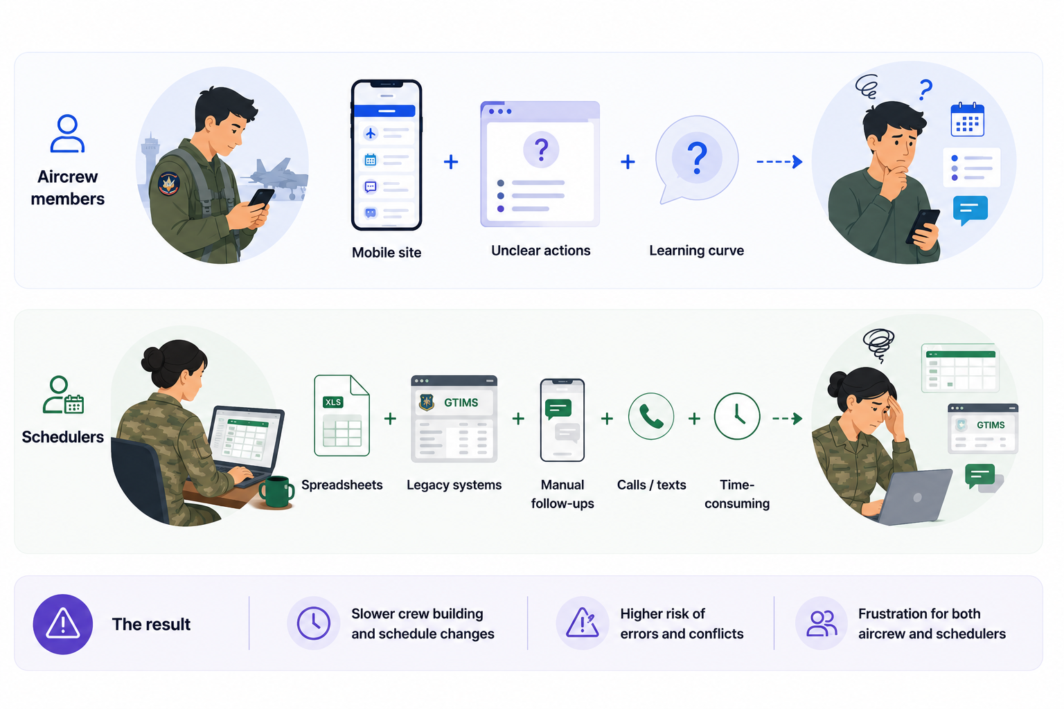
Interviews with several US Air Force squadrons revealed consistent frustrations
Remote interviews revealed a consistent story across squadrons: mobile mattered most when time and attention were limited.
Project goals
Designing for fast, confident action on the go
01
Act
Put critical scheduling actions within easy reach.
02
Understand
Structure information around users’ mental models.
03
Complete
Bring essential desktop tasks into the mobile flow.
04
Navigate
Create familiar routes that reduce friction between pages.
User flow
Using user flows to understand scheduler and aircrew tasks
Mapping a simpler experience before moving into interface design
I created a user flow to map out the steps users would take to navigate pages based on their role as an aircrew member—such as a pilot or loadmaster—or as a mission scheduler.
Defaulting to the member view instead of the scheduler view allows squadron members to carry out their main tasks more quickly on the go, while schedulers can switch roles when they need to manage missions away from the desktop experience they typically use for planning.
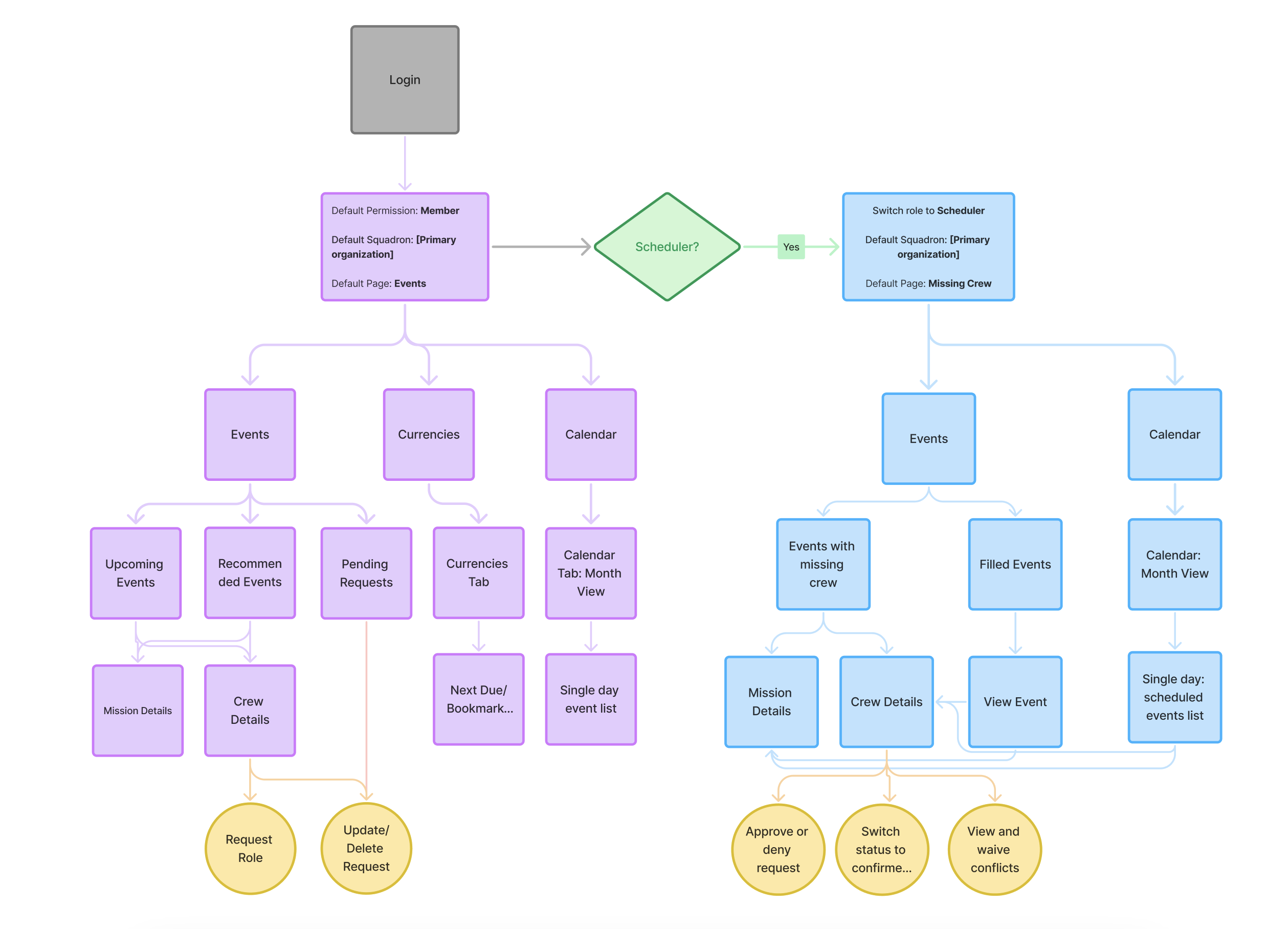
The new flow defaults to the aircrew member experience, then exposes scheduler-specific event and crew-management tasks when the user switches roles.
Iterations
Balancing mission-critical detail with a simpler mobile experience
User insights and design feedback helped sharpen the hierarchy across each iteration
Balancing all the information needed to fly missions while keeping the experience simple and not overwhelming was challenging. User insights and design feedback helped me hone my visual design skills and create a clearer display of information.
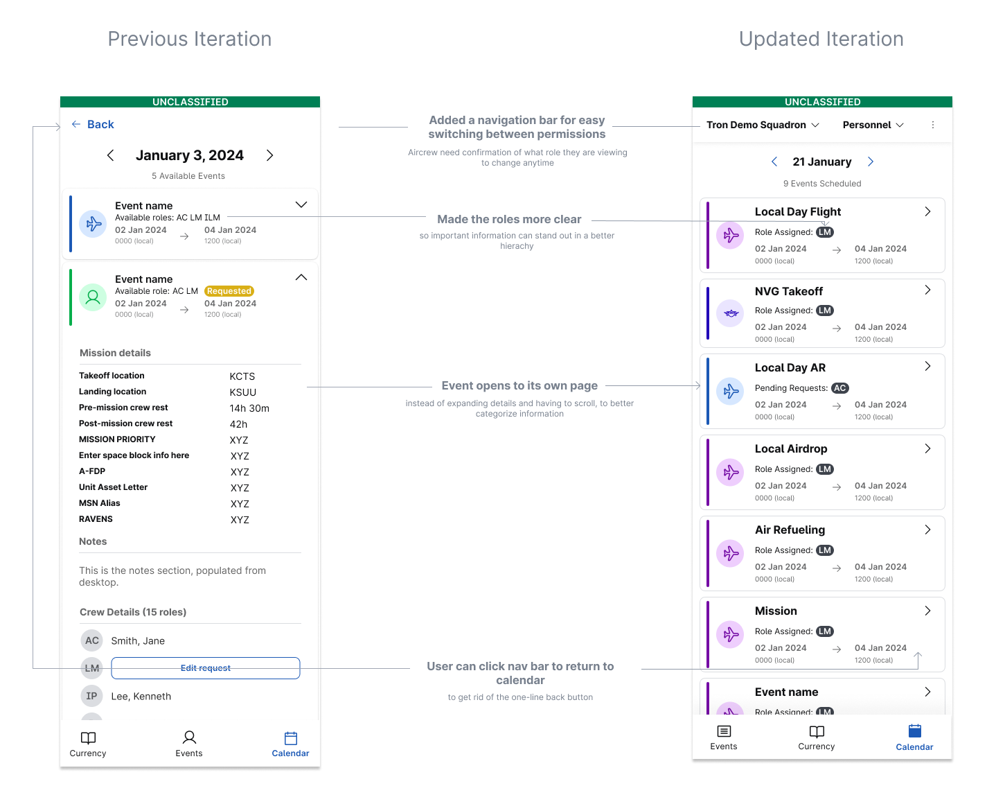
The single-day event list evolved to clarify roles, separate event details into focused pages, and provide persistent navigation.
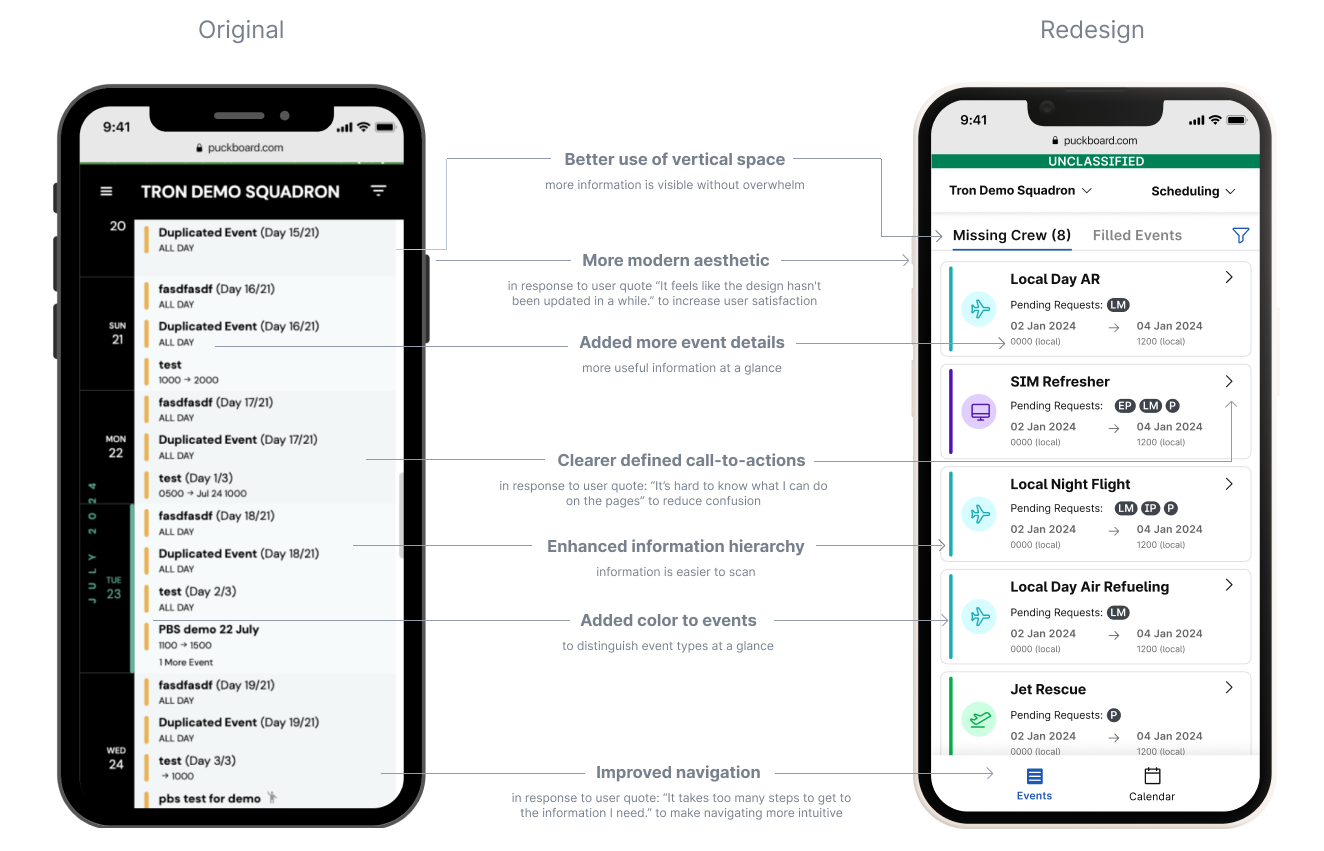
The before-and-after view gives schedulers a clearer, more scannable way to identify events with missing crew.
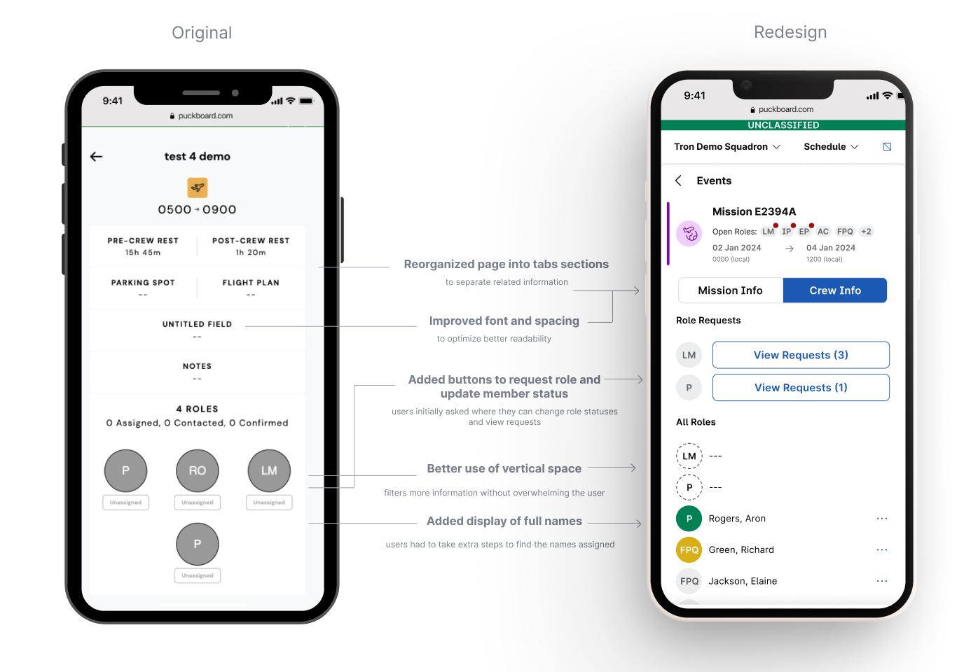
The redesigned event detail page organizes mission and crew information into tabs while making role requests and statuses visible and actionable.
Feature overview
Role-based tools for schedulers and personnel
Each experience prioritizes the tasks users need most while away from desktop
The redesigned mobile experience adapts to the user’s role, giving schedulers focused tools for managing mission coverage while helping personnel quickly review and act on their own assignments.
Scheduler overview
Schedulers can review events with missing crew, scan mission details, respond to role requests, and identify or waive scheduling conflicts from a task-focused mobile workflow.
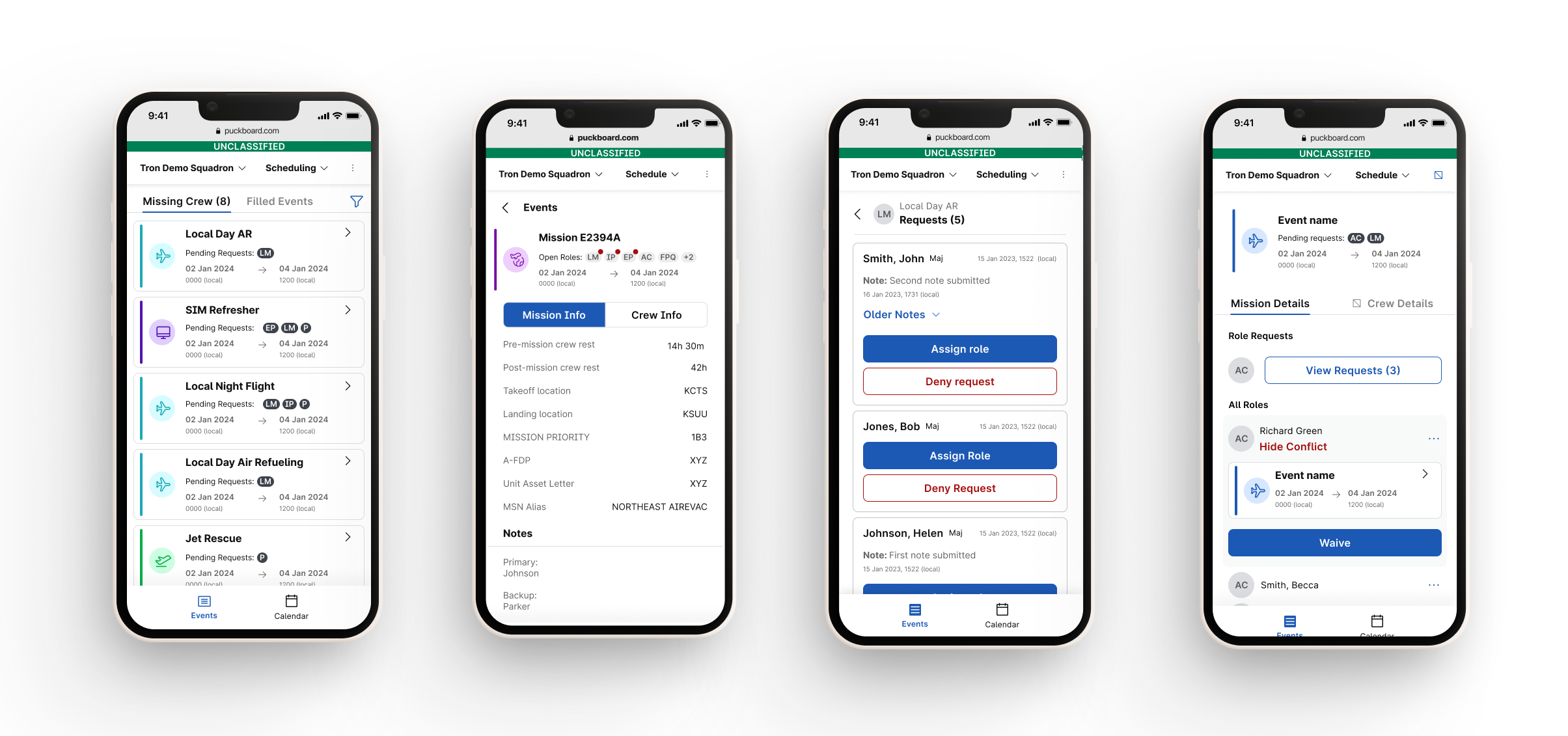
Event details, request management, and conflict resolution give schedulers the context and actions needed to keep missions staffed.
Personnel overview
Aircrew members can review upcoming events, manage role requests, scan their calendar, and track currency requirements without navigating through scheduler-focused tools.
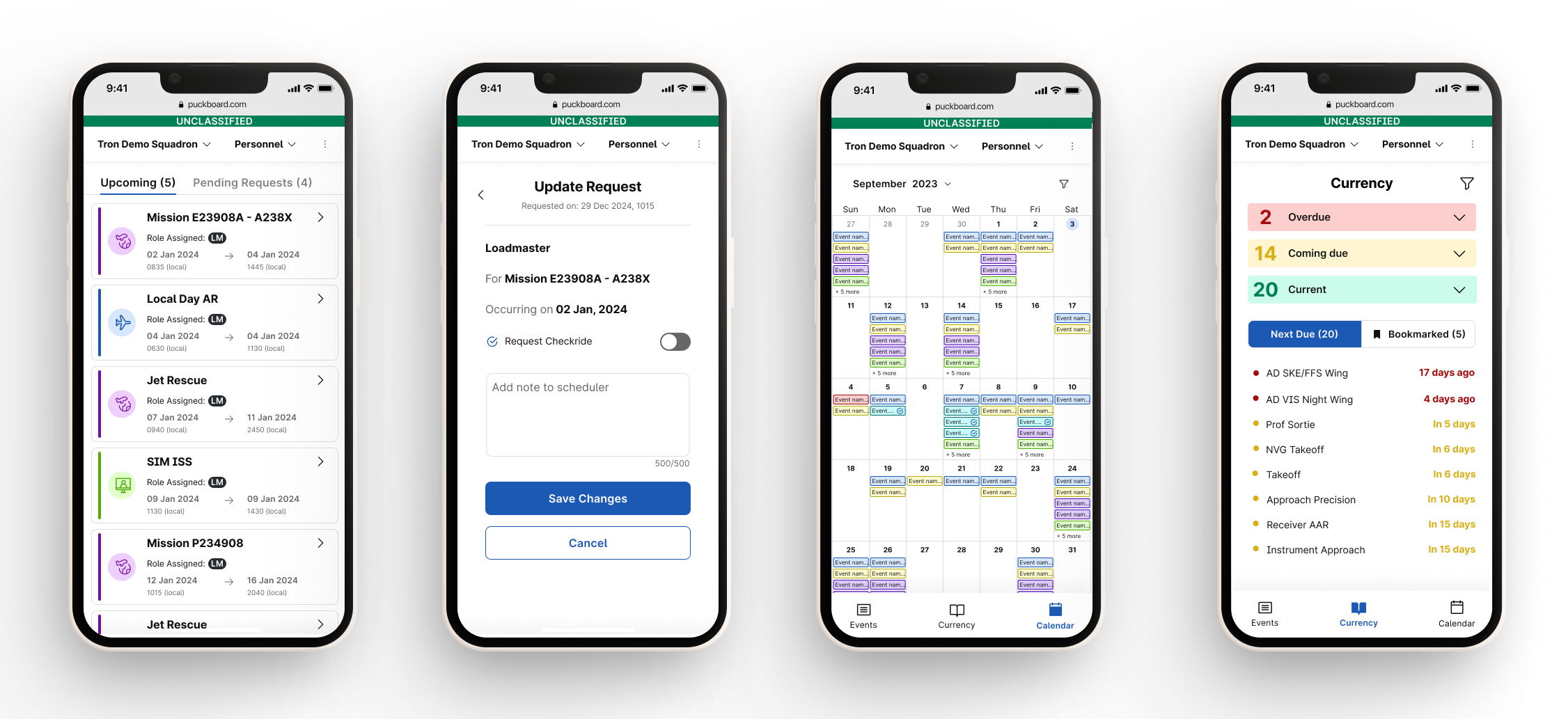
Upcoming events, calendar, requests, and currency flows support the most common aircrew tasks on the go.
Feedback & Results
The difference was visible in both adoption and daily sentiment
“The difference is like night and day.”
“There are no complaints on the message channels from the haters; it’s been silent!”
Impact
Results and signals
2,440%
Mobile adoption increased 🚀
Mobile adoption increased after the redesigned experience was introduced.
5 → 127
Active mobile users 📈
Structured navigation, role-based access, and a task-focused UI helped mobile workflows reach far more users.
Core
Part of daily operations 📊
The redesign transformed mobile from an underutilized tool into a core part of daily operations.
Learnings & Reflection
Designers read between the lines of what users say.
Balance familiarity with innovation.
Schedulers were used to a certain way of working. Instead of radically changing everything, we focused on incremental improvements—like reorganizing navigation while keeping key elements recognizable. This made adoption smoother and less disruptive.
Research-driven decisions have power.
Initially, some schedulers requested more customization options, but research showed they needed faster task completion, not more complexity. The redesign focused on simplifying workflows rather than adding features, leading to a significant increase in adoption.