Impact
A modernized workspace for mission scheduling
The redesign gave schedulers a clearer way to review dense mission timelines, create and edit events, and understand schedule state without losing the depth they depended on for daily operations.
User research
Schedulers needed clarity without sacrificing operational detail
Research with squadron schedulers highlighted where the legacy experience slowed daily planning
Desktop scheduling was the primary place where mission schedulers planned, edited, and reviewed the squadron schedule. The interface needed to support dense information, but the structure around that information was creating extra work.
Too much lived on the same surface
Events, people, requests, conflicts, and schedule context competed for attention in the same workflow.
Planning and review blurred together
State changes needed to be easier to trust
Schedulers needed clearer cues before committing edits to mission plans.
Project goals
Designing for confident scheduling at desktop scale
01
Scan
Make dense schedule information easier to read across day, week, and month views.
02
Edit
Keep event creation and updates close to the schedule context.
03
Coordinate
Expose personnel, requests, and event needs in the moments schedulers use them.
04
Align
Bring the experience into the product design system without disrupting core workflows.
Workflow
Using annotated before-and-after screens to connect design changes to user needs
The redesign focused on the surfaces schedulers and aircrew used most: schedule review and the member dashboard
The annotated screens helped show why each change mattered. Instead of presenting the redesign as a visual refresh, I tied the updated layouts back to user insights around scanning, comparing, finding actions, and understanding schedule state quickly.
Iterations
From crowded scheduling surfaces to clearer, role-aware workflows
Each annotated row shows the design rationale behind the improvements
The challenge was not simply making the product feel newer. Schedulers were already fluent in the work, so the redesign needed to preserve recognizable planning behavior while making key actions and state changes easier to find.
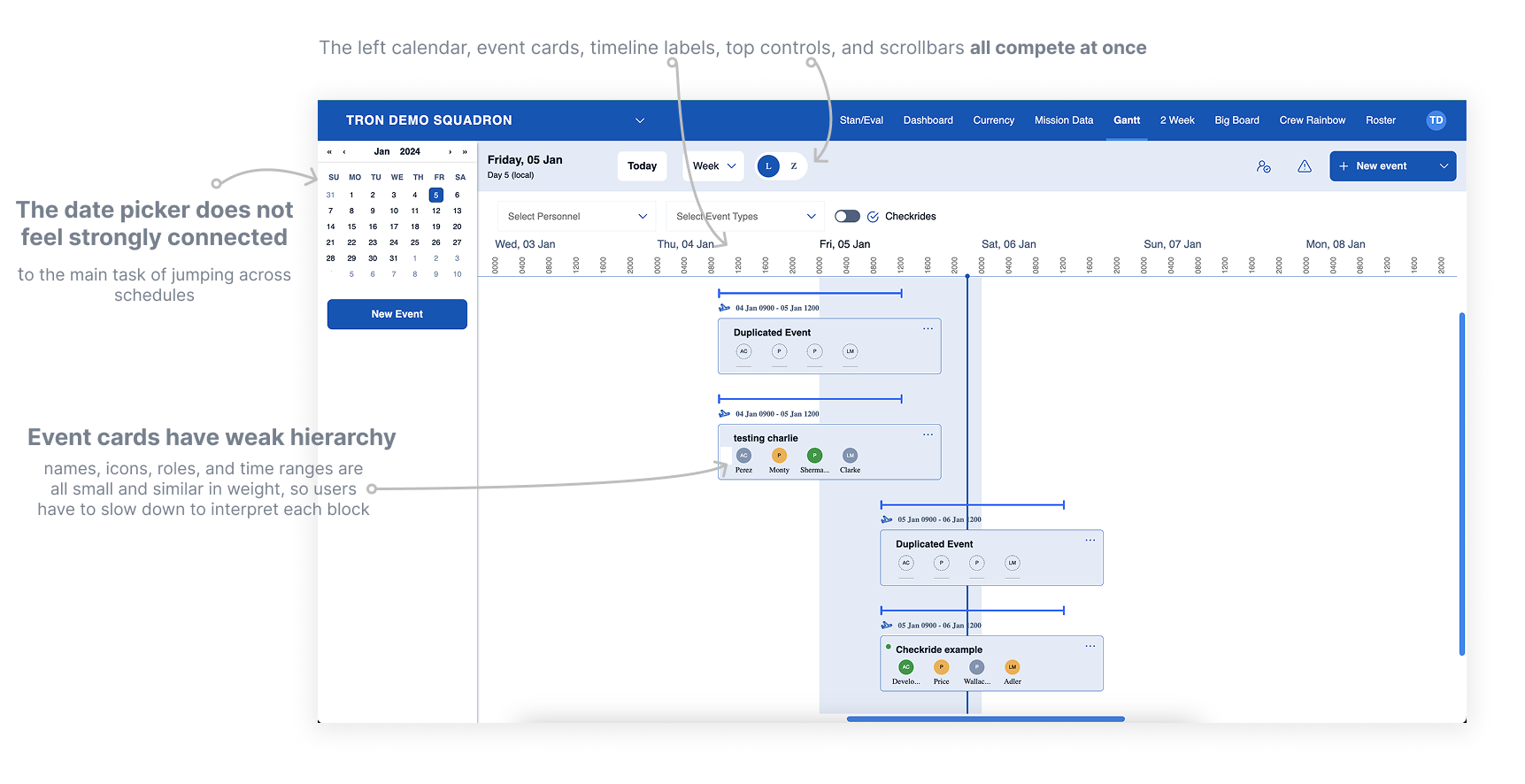
Before: the Gantt view asked users to interpret too many competing controls while event cards and date navigation lacked strong hierarchy.
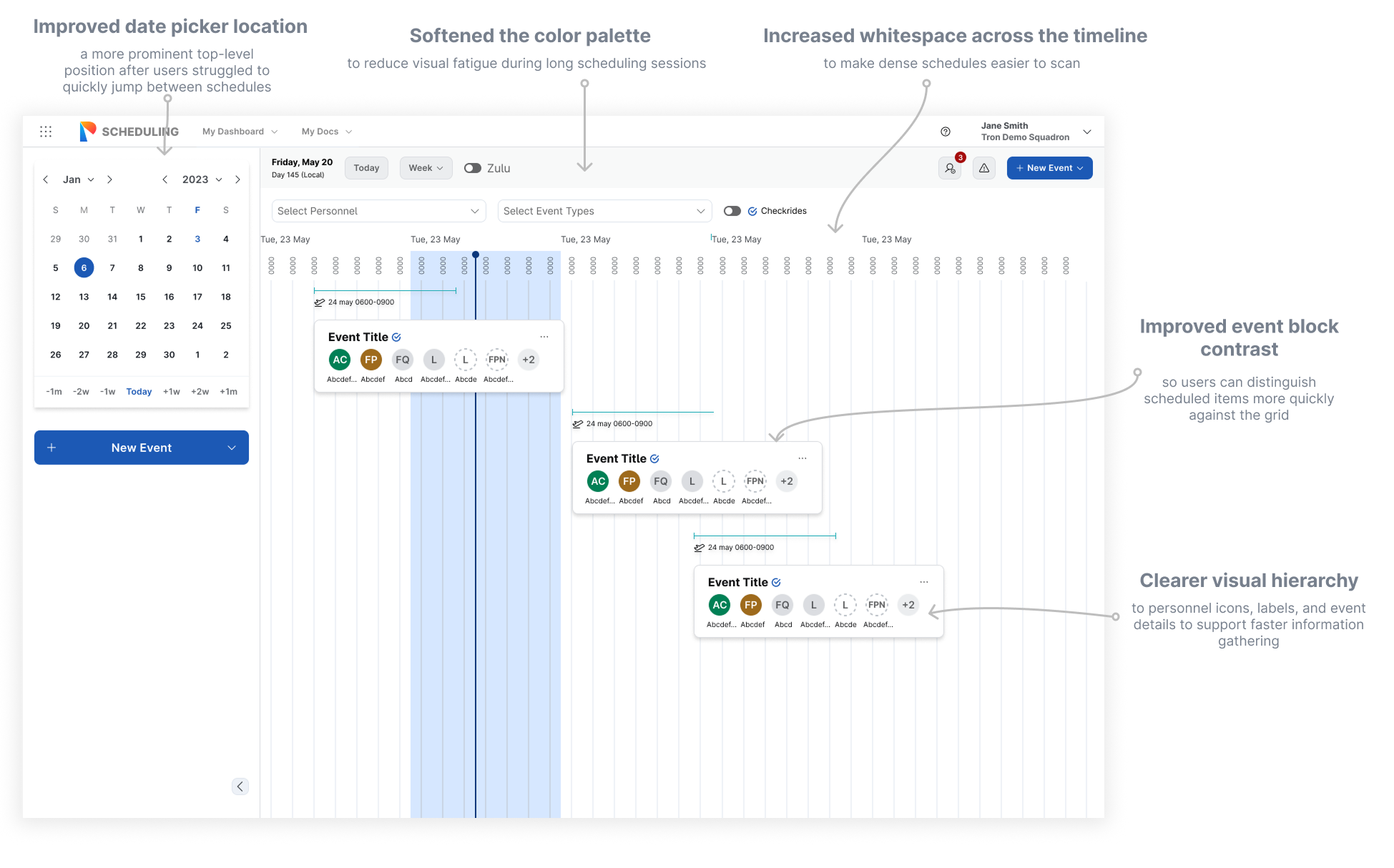
After: the redesigned schedule view reduces header weight, clarifies event color coding, improves card readability, and makes key actions easier to find.
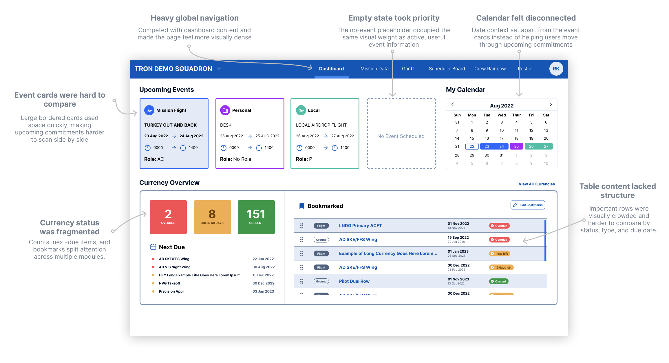
Before: the member dashboard split attention across heavy navigation, oversized cards, a disconnected calendar, and fragmented currency status.
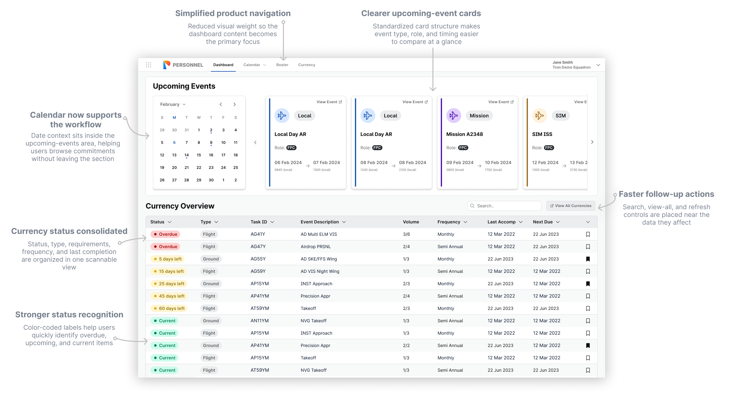
After: the updated dashboard brings calendar context into the workflow, standardizes upcoming-event cards, consolidates currency status, and places follow-up actions near the data they affect.
Feature overview
Design changes grounded in user insights
The final design made dense scheduling information easier to scan without removing the details users needed
Schedule view
Clearer event scanning
Stronger color coding, lighter navigation, and higher-contrast event cards helped schedulers identify event types and urgency faster.
Member dashboard
More useful dashboard context
Upcoming events, calendar context, and currency requirements were reorganized around the tasks aircrew return to most often.
Actions
Faster follow-up
Search, view-all, request, and creation actions were placed closer to the information users needed to act on.
Feedback & Results
The redesign made core scheduling work feel more organized
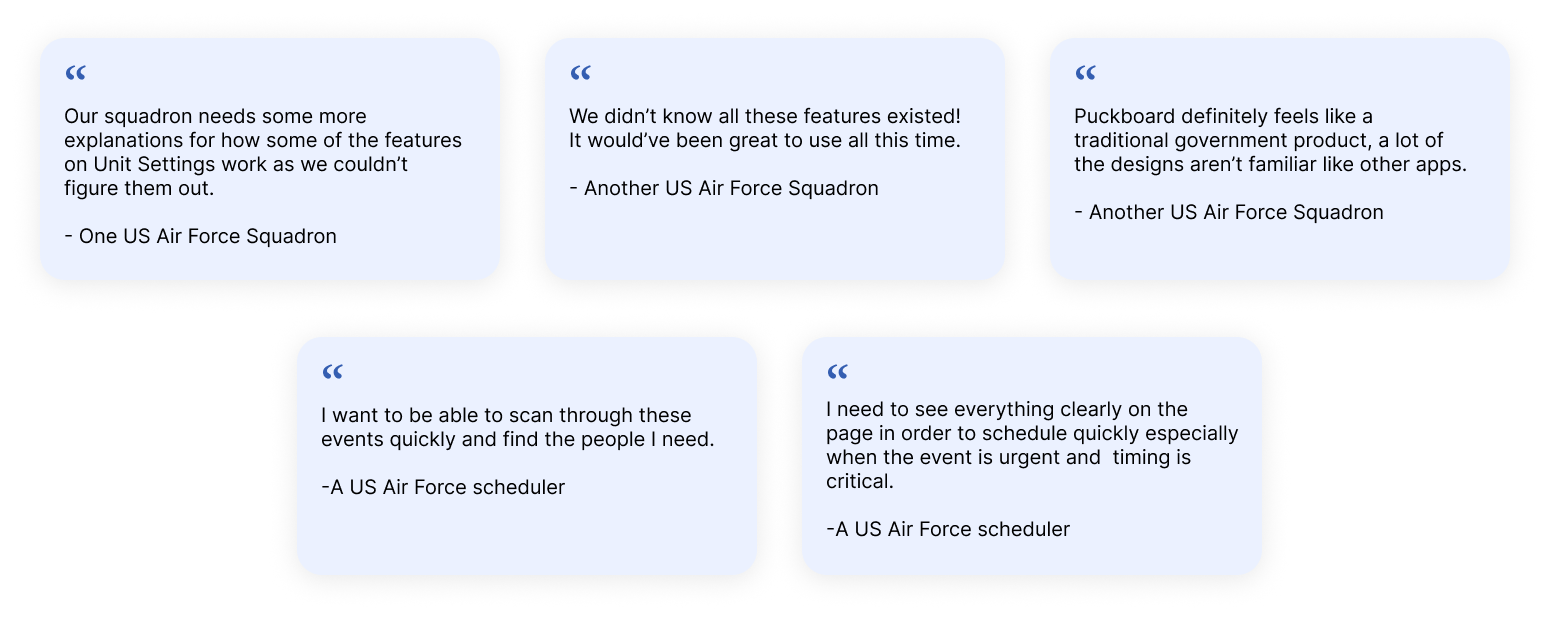
User feedback reinforced the need for clearer feature discovery, more familiar patterns, and faster event scanning in urgent scheduling moments.
Clearer hierarchy helped schedulers understand what needed attention.
Reusable patterns made the product easier to align with the new design system.
Impact
Results and signals
Updated
Core scheduling workflow
Modernized the primary desktop scheduling experience while preserving the depth users needed for operational planning.
Clearer
Schedule review
Made event state, timing, details, and actions more visible in the flow of work.
Aligned
Design system usage
Created reusable patterns that could scale across related scheduling and personnel workflows.
Challenges
Constraints that shaped the design
High information density
The work required careful hierarchy decisions so the interface stayed powerful without feeling chaotic.
Legacy expectations
The redesign had to modernize the product while respecting workflows schedulers already depended on.
Learnings & Reflection
Modernizing complex software means protecting what is useful while removing what is accidental.
Dense tools need deliberate hierarchy.
This project reinforced that enterprise UX is not about removing complexity. It is about making essential complexity easier to navigate.
Familiar workflows still need room to evolve.
The redesign worked best when it kept the scheduler's mental model intact while clarifying the surrounding structure, actions, and visual system.