Overview
Refreshing a first-time signup experience for product teams
Amplitude is a B2B product analytics platform that helps teams understand user behavior and build better digital products. During my May-August 2022 internship, I worked across onboarding, signup, invite emails, notification settings, and new user education. My main focus was refreshing the onboarding flow so new users could create an account with more clarity and confidence.
Signup
Refreshed onboarding flow
Updated account creation screens to make the path feel more consistent and easier to complete.
Invite
New user email and signup screens
Improved the invitation experience for users joining an existing team.
Education
Onboarding checklist and tours
Introduced clearer guidance to help new users discover important product features.
Problem
The original signup flow lacked consistency, clarity, and had an above-average user drop-off rate.
Research & Discovery
User bounce rate kept increasing as the flow progressed
Amplitude's own analytics helped identify where users were losing momentum
The original first-time signup flow included eight screens: Get Started, email, username, team, role, company details, password, and organization setup. Quantitative product data made it possible to inspect the flow in detail and see exactly where users were dropping off.
The biggest issue was the email verification step. Users were redirected away from the website to activate their account, and many did not return to complete setup.
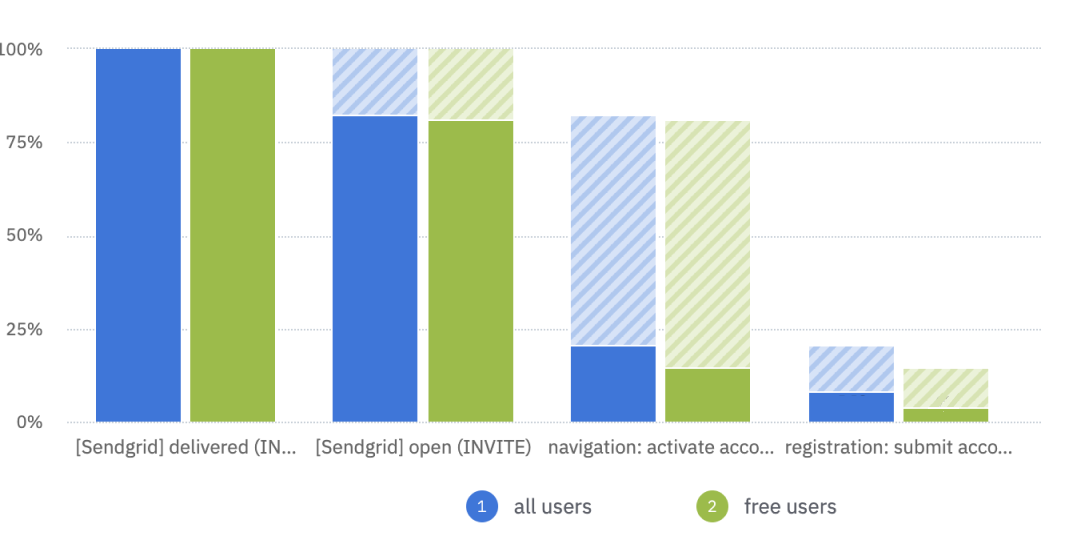
Signup data showed drop-off increasing as the flow progressed, with the largest friction around email verification and returning to the website.
Goal
Provide a clear, concise, and warm onboarding experience
After weekly feedback sessions with my team and cross-functional designers, I moved toward a flow that condensed related screens, introduced clearer progress cues, and made each step feel more approachable. Updates included a progress bar, more personalized copy, illustrations, help text, consistent containers, and clearer calls to action.
01
Clarify progress
Show users where they are in signup and how much remains.
02
Reduce uncertainty
Use validation, help text, and clearer next steps to prevent hesitation.
03
Warm the tone
Make the first impression feel branded, welcoming, and trustworthy.
04
Create consistency
Align boxes, calls to action, and visual patterns across the flow.
Iterations
Turning unclear setup moments into guided steps
I explored updates to the password setup screen and activation email to reduce friction at critical points
The password setup screen needed to communicate requirements without feeling like an error state. The activation email needed to make the redirect feel intentional, trustworthy, and easy to act on.
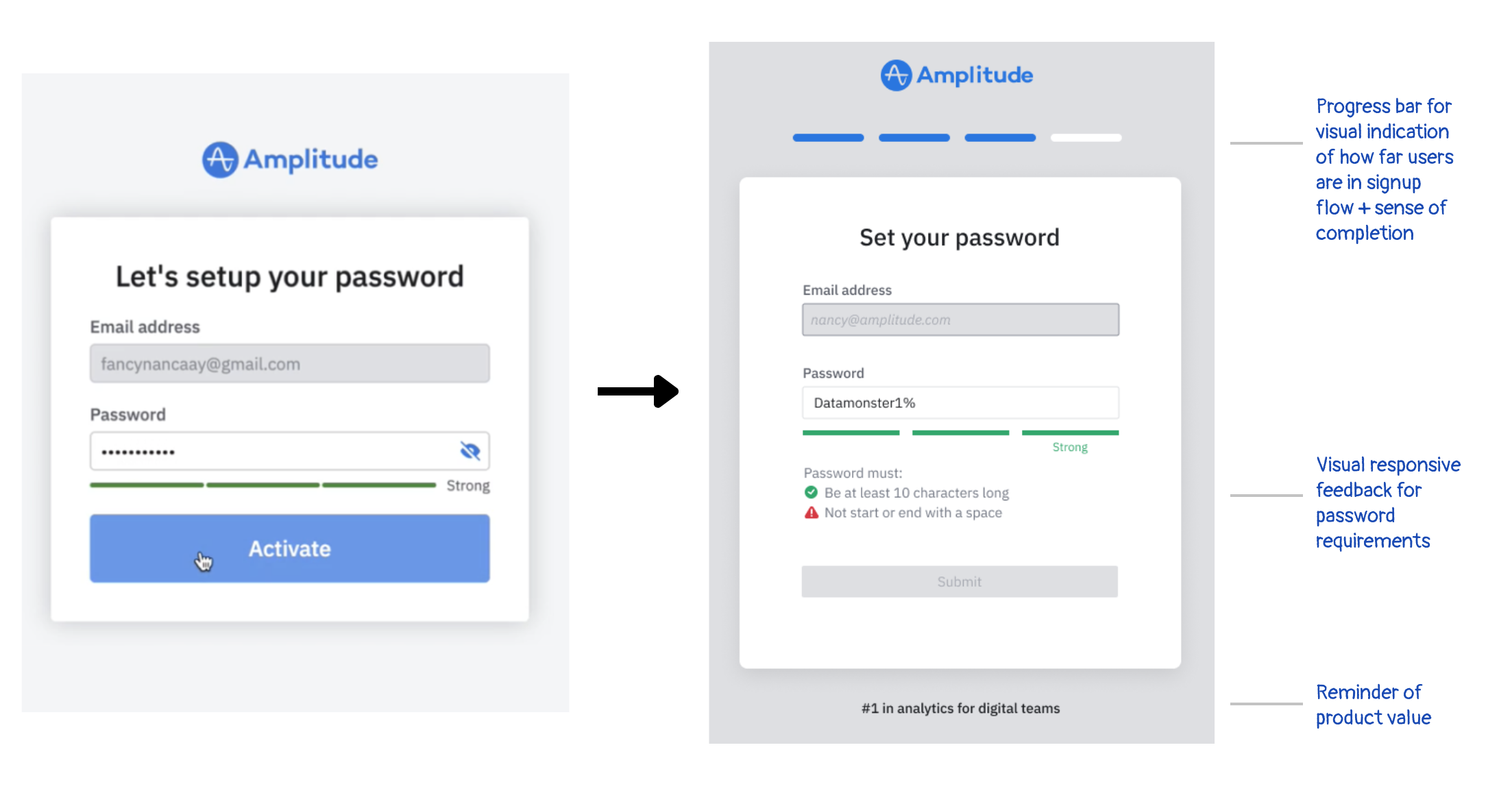
Password setup iteration: added a progress bar, clearer password requirements, responsive validation feedback, and a small reminder of product value.
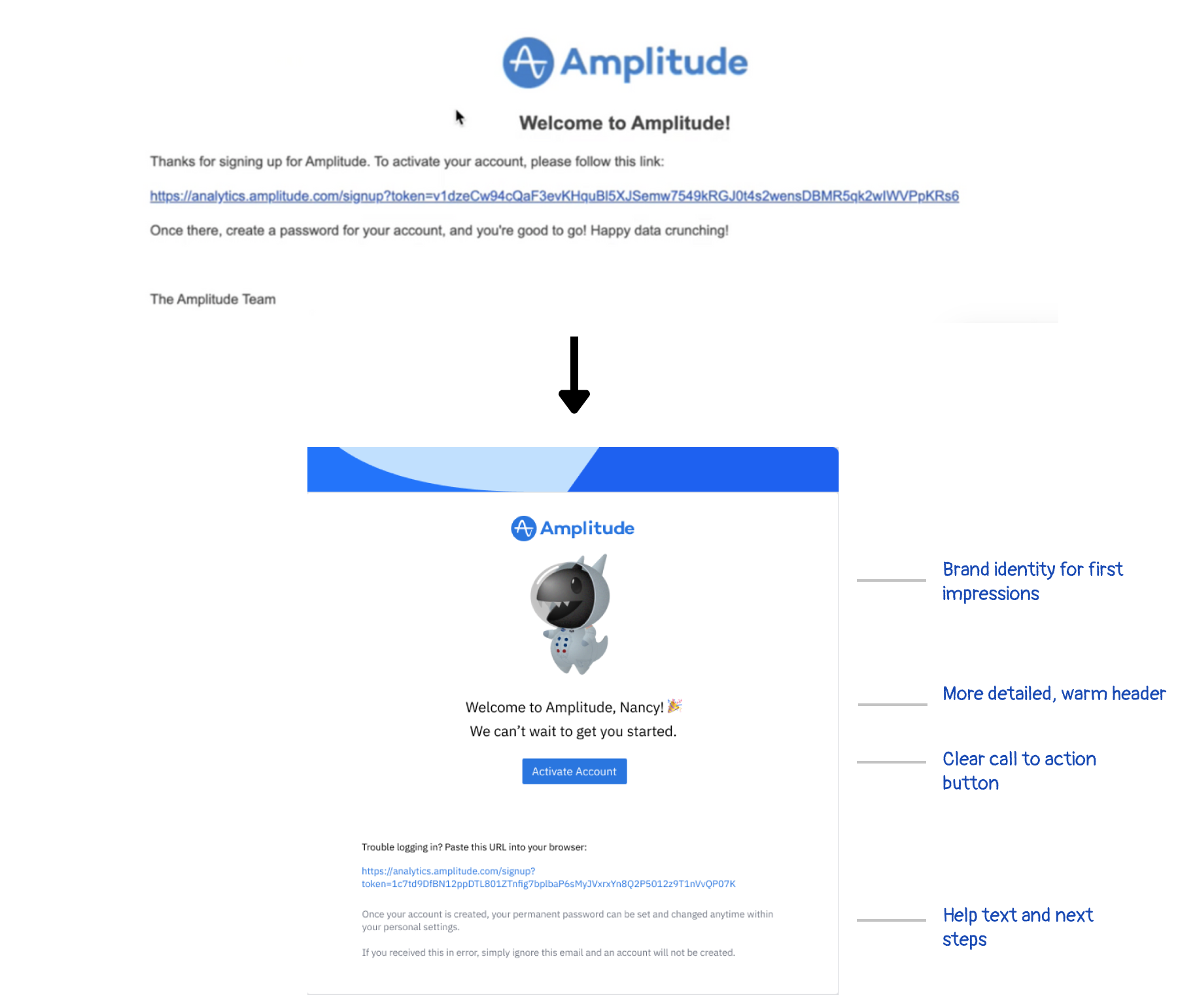
Email verification iteration: replaced a raw activation link with a branded email, warmer copy, a clear CTA button, and fallback instructions.
Design critique
Using critique to align on tone, usability, and first impressions
Feedback sessions helped pressure-test design details before finalizing the flow
Weekly critiques with cross-team designers and product partners helped shape the final direction. These conversations were important because onboarding was a user's first impression of Amplitude, and small choices around copy, visual polish, validation, and calls to action could affect whether someone continued or dropped off.
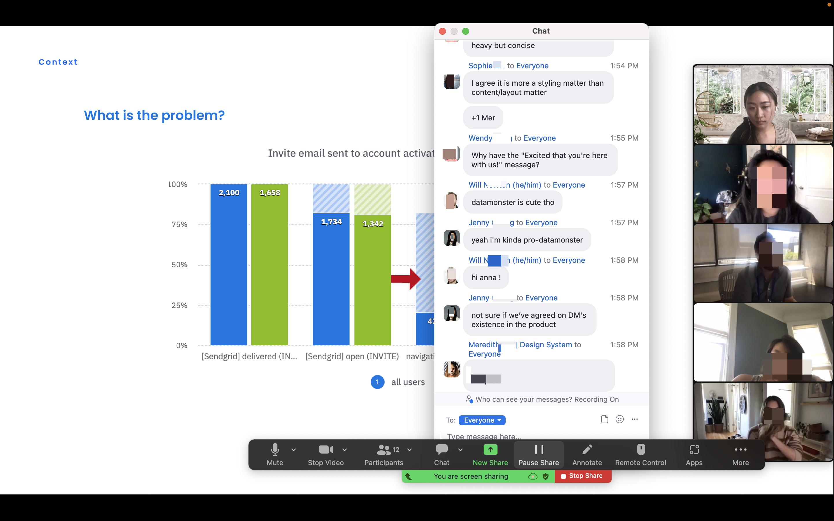
Design critique helped turn research findings into concrete improvements across layout, interaction, and tone.
Final key flow screens
A more cohesive signup path with clearer progress and friendlier guidance
The final screens brought the signup experience into a more consistent and confidence-building flow
The final onboarding flow condensed related steps, made progress visible, and standardized screen structure across account setup. The updated designs helped users set a password, join or create an organization, and understand what came next without losing momentum.
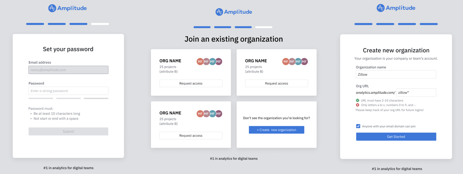
Final key screens: password setup, joining an existing organization, and creating a new organization.
Impact
Results and signals
2x
Signup funnel success
After release, the signup funnel conversion rate doubled in successful signups.
~10%
Lower email verification drop-off
Revamping the email verification experience created the largest change, decreasing drop-off by about 10%.
More consistent
Setup patterns
Updated containers, validation states, help text, and calls to action made the flow feel more cohesive from screen to screen.
Less friction
Critical setup moments
The final design focused on the areas most likely to create hesitation: email verification, password setup, and organization selection.
Key Takeaways
Feedback and iteration shaped the final experience
Prioritize feedback from team members early. This summer was an experience I will always remember. I absorbed so many new insights about the ever-changing world of design from a thoughtful community of teammates, and I grew professionally in ways I did not expect.
Design is an ever-changing, iterative process. Strong products go through many rounds of refinement, and even successful designs are revisited over time. While working through this project, I learned to evaluate each iteration against the project goals, stay confident in the improvements I had made, and balance design polish with time constraints and development schedules.