Sole Product Designer
Length
1 week
Year
2025
Enterprise users must assess risk across hundreds of data points when selecting components. In the existing experience, critical risk signals were buried across tabs and tables, requiring users to explore before knowing where to focus.
The Problem
How might we help users quickly identify high-risk areas
of a part without forcing them to comb through dense data first?
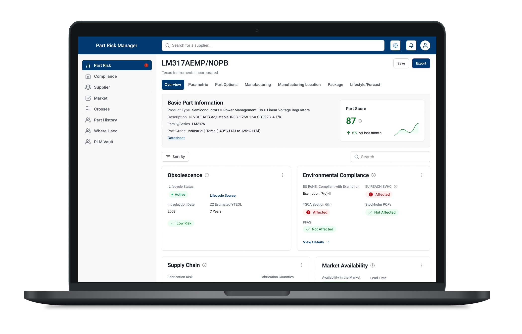
Risk-first dashboard concept

Constraints 🚦
Time-boxed interview exercise
No direct user research
Required to align with an existing enterprise UI and brand system
Large, complex dataset (400+ data points, 30+ tabs)
Existing Experience
Risk signals are buried under dense navigation
and data
Users must explore multiple tabs and tables before understanding where risk exists, making it difficult to quickly scan, prioritize, and decide where to focus.
Design Goal
Enable fast risk discovery by surfacing what’s risky, why it matters,
and where to go next without removing access to detailed data.
Key Design Moves
Making risk scannable at a glance
The experience was restructured to prioritize risk detection before deep analysis. Clear navigation separation, stronger visual hierarchy, and accessible status indicators help users quickly scan, identify high-risk areas, and decide where to focus next.
Risk Visibility & Context

Navigation clarity

Scanability & Discovery

Comparison to Existing Flow
Before vs. After: Risk Discovery in the Existing Flow
A focused comparison showing how risk signals move from buried to immediately visible.

Action Items
What I’d do next
Validate risk discoverability through first-click and timed-task testing to confirm users can identify high-risk areas quickly.
Quantify impact by measuring time-to-risk identification, scroll depth, and navigation steps compared to the existing flow.
Refine prioritization behavior by testing default risk-based sorting and allowing users to select preferred views.
Extend proactive workflows with alerts or saved risk views for repeat monitoring of critical components.
Reflection
Why this case matters
This case demonstrates how I approach complex enterprise problems by prioritizing decision-making over surface-level UI changes. It shows my ability to work within real constraints like existing systems, dense data, and limited research while still delivering a clearer, more actionable experience for users.